Near Mobile Application
A better way to bring communities together in an increasingly remote world


Overview
ROLE
UX Designer
UX Research Support
TOOLS
Miro
Figma
Google Suite
Zoom
Trello
DURATION
5 Weeks
TEAM
6 Designers
PROBLEM
SOLUTION
IMPACT
In an increasingly remote world, young adults report difficulty making friends outside of work or school, and within the community.
If we create way to facilitate building in-person, communal connections, this will lead to friendships, larger networks, and more integrated communities.
Near is a social networking app that allows apartment residents to connect with each other in a low-pressure environment.
Of our tested users, 85% indicated that they would prefer Near to existing competitors.
User Research
HYPOTHESIS
If tenants have an interest in building bonds with their neighbors within their apartment community, then an app that facilitates socializing with an emphasis on physical proximity could increase community engagement and heighten people’s satisfaction with their living environment.
SURVEYING USERS
To validate the need for this product, we conducted an online survey of 100 individuals between the ages of 22 and 30 in a 24 hour time period.
Over half of the individuals surveyed do not know their neighbors, and 85% don't have a platform to connect with their neighbors or find out about community events.
57% don't know their neighbors

52% would like to know their neighbors better

85% don't have a platform to facilitate this

65% didn't know of community events

79% want to know of community events

USER INTERVIEWS
Once the need was validated, we conducted 5 remote user interviews with users of the same 22 - 30 age range that live in community or apartment environments.

KEY TAKEAWAYS
difficulty meeting their neighbors despite wanting to
difficulty staying in the know of local events
no resident platforms to facilitate the above issues
I definitely want to meet some more neighbors and I miss when I was a kid growing up, [having neighborhood barbecues and pool parties].
- Sam, 24
COMPETITOR ANALYSIS
Continuing to dig into areas of opportunity, we conducted a competitor analysis of similar apps and services on the market already.
easy to join but include ID verification for safety
focus on physical proximity to foster communal connection

USER PERSONA
Following our research, we created a user persona to create a realistic representation of one key segment of our primary audience. Then we built out an empathy map to dig into our users needs, feelings, and frustrations

STORYBOARD
We wanted to continue to weave a story for our user to further understand what opportunities we could implement in the redesign.
ideally Near would be presented at move in
common personal interests are key to highlight in the app


FEATURE PRIORITIZATION
After ideating feature and function ideas. We took the final contenders and placed them in a prioritization matrix to focus in on the main features we were going to implement.
PRIMARY FEATURES
a newsfeed with posting, filtering, liking, commenting
a way to RSVP to events

a calendar to view upcoming events
Wireframing & Prototyping
USER FLOWS
To lay the groundwork for prototyping, we built out user flows for each of the primary functions. This gave us an idea of the screens we would need and the actions taken on each of them.
.jpg)
DESIGN SYSTEM
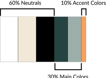
To ensure consistency and accessibility across all pages and content, we established a style guide and design system including colors, fonts, and components.
COLOR DESIGN

TYPOGRAPHY DESIGN


BUTTON DESIGN
LOW FIDELITY
PROTOTYPE
In our first iteration, we wanted to establish a general layout and look of where we wanted features.


PROTOTYPE TESTING
To determine the validity of our concept design, we conducted 4 additional remote Guerrilla tests using the initial prototype mockup.
KEY TAKEAWAYS
increase privacy assurance
improve consistency throughout the application
provide more information in the app for user guidance
MID FIDELITY
PROTOTYPES
In this iteration, we implemented the changes needed found in the user testing. In addition, we refined the design by using actual icons, boxes, and characters to get a more realistic feel.


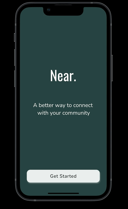
HIGH FIDELITY
PROTOTYPES
Using our mid fidelity prototypes, we then applied the colors and designs from the style guide along with button prototyping to finish out the High Fidelity prototypes.
Reflection
NEXT STEPS
Given the scope of this project, there were some things we did not get to, but that would be ideal.
Additional Functionality
If additional time was provided, we would want to build out the direct messaging, user profile creation and changing, the community admin side, and possibly adding community space functionality such as maintenance requests
Additional Testing
The prototype was only tested in the initial sketching phase, it would benfit from additional user testing.
KEY TAKEAWAYS
Coming to the end of the project, our team took a moment to reflect with the team about what went well and what we could have done better.
Managing Scope Creep
There was so much we wanted to include and build out that would have required much more time and resources, so we had to learn how to manage the scope.