Girlstart Nonprofit Website Redesign
A design to empower and equip the next generation of women in STEM


Overview
ROLE
UX Research Design Support
TOOLS
Miro
Figma
Google Suite
Zoom
Trello
DURATION
5 Weeks
TEAM
6 Designers
PROBLEM
SOLUTION
IMPACT
Girlstart is a non-profit dedicated to empowering and equipping girls in STEM. Girlstart’s website promotes donations & volunteering while providing information on their educational programs & events.
We have observed that users have difficulty navigating the website to quickly and easily find information on participant, volunteer, and donor opportunities.
Improve the efficiency, ease, and experience of the website so users can learn more information about Girlstart.
Users will be better supported while visiting the website with a 71% quicker navigation time in information finding and task completion.
User Research
HYPOTHESIS
We believe that by simplifying and streamlining the interface & navigation of Girlstart’s website, we can decrease the difficulty users have in completing tasks, which will allow for better engagement and participation from site visitors.
COMPETITOR ANALYSIS
Wanting to understand how competitors present their organizations as well as their strengths and weaknesses, we conducted a competitor analysis.
KEY INSIGHTS
Clear Communication of Purpose and Services
Clean and
Consistent Design

CURRENT UX ISSUES
To assess what their current user experience was, we conducted a full heuristic analysis and mapped out some specified user flows. We completed this for desktop, tablet, and mobile modalities.
KEY ISSUES
Lack of Content Hierarchy
The lack of content and color hierarchy does not direct the users eye, making navigation more difficult.
Nonintuitive Search Function
The subscribe input field resembles the typical search box, leading most users to go there first, making it confusing.
Navigation Dead Ends
There is not a consistent way to bring the user to the homepage, resulting in dead ends in navigation.
Inconsistent Design
Many pages throughout the site have a different color scheme. This is confusing to the eye and disruptive of the experience.

USABILITY TESTING & RESULTS
We conducted 15 remote guerrilla tests on desktop, tablet, and mobile modalities. Each user had 5 tasks to complete. We measured how long it took them to complete the task, if they completed it, and their thoughts/reactions during testing.
TEST RESULTS
70%
struggled to find the search bar
100%
overwhelmed
by the amount
of text
100%
confused
by the primary navigation
STAKEHOLDER ALLIGNMENT
We spoke to Anna, the Girlstart’s Chief Development and Communications officer. We got insights into Girlstart’s desired website changes and website metrics. Our interview with her and their website metrics aligned with the results of our user testing.

I would love to consolidate information on the website and make it easier for people to find things.
Anna, Girlstart CCO
USER PERSONA
Following our research, we created a user persona to create a more realistic representation of one key segment of their primary audiences. Then we built out an empathy map to dig into our users needs, feelings, and frustrations to ensure our solution catered to them.

STORYBOARD &
USER JOURNEY
We wanted to continue to weave a story for our user to further understand what opportunities we could implement in the redesign:
USER JOURNEY OPPORTUNITIES
Clear Mission/Programs
Upfront Program Pricing
Concise Information


Wireframing & Prototyping
INFORMATION
ARCHITECTURE
Assessing the navigation, we performed card sorting to see what categorizing makes sense to our users to ensure that users intuitively know where to go. Taking the results from the card sorting, we created a sitemap with the new information architecture.
NAVIGATION OPPORTUNITIES
Rename Navigation Menu
Reduce Navigation Redundancy
Decrease Submenu Length

NEW SITEMAP OVERVIEW
NEW DESIGN SYSTEM
To ensure consistency and accessibility across all pages and content, we established a style guide and design system including colors, fonts, components, grids and spacing, accessibility, and usage instructions

TEXT ON COLOR

COLOR DISTRIBUTION

GRID, GUTTER, MARGIN DESIGN
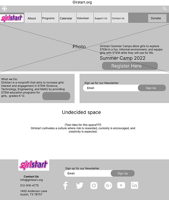
LOW FIDELITY
PROTOTYPE
In our first iteration, we wanted to establish a general layout and look of where we wanted features. We created low fidelity sketches for mobile, tablet, and desktop.


DESKTOP/TABLET

MOBILE
PROTOTYPE TESTING
To determine the validity of our concept, we conducted 15 additional remote Guerrilla tests using the prototype and the same tasks as our initial tests.
TEST RESULTS
62%
faster locating the search bar on mobile
71%
faster at finding summer camp information
57%
faster locating the search bar on desktop
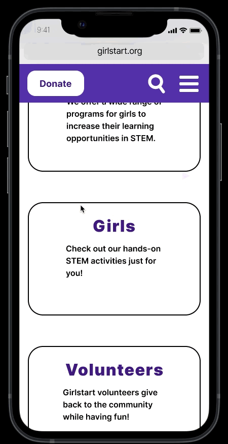
MID FIDELITY
PROTOTYPES
With our test results confirming that we had improvements in user interactions, we made our design more complete and presentable with mid fidelity prototypes.

DESKTOP/TABLET
MOBILE
HIGH FIDELITY
PROTOTYPES
Using our mid fidelity prototypes, we then applied the colors and designs from the style guide along with button animations to create the High Fidelity prototypes.

Reflection
NEXT STEPS
Given the scope of this project, there were some things we did not get to, but that would make this redesign even better for the user.
A/B Testing
Some additional time to make a few additional high fidelity mockups and run through A/B would have allowed us to further fine tune our design for the user.
Additional Personas
Running through the research, ideation, and prototyping for other users of the website (donors, teachers, etc) would improve the overall usability
KEY TAKEAWAYS
Coming to the end of the project, our team took a moment to reflect with the about what went well and what we could have done better.
Utilize Testing Platforms
Utilizing a platform like Maze, would have allowed the calculation of metrics to be a lot quicker and would have given us more metrics.
Earlier Engagement
Communicating earlier in the design process with our stakeholders would have been helpful in the earlier stages of the design process.